
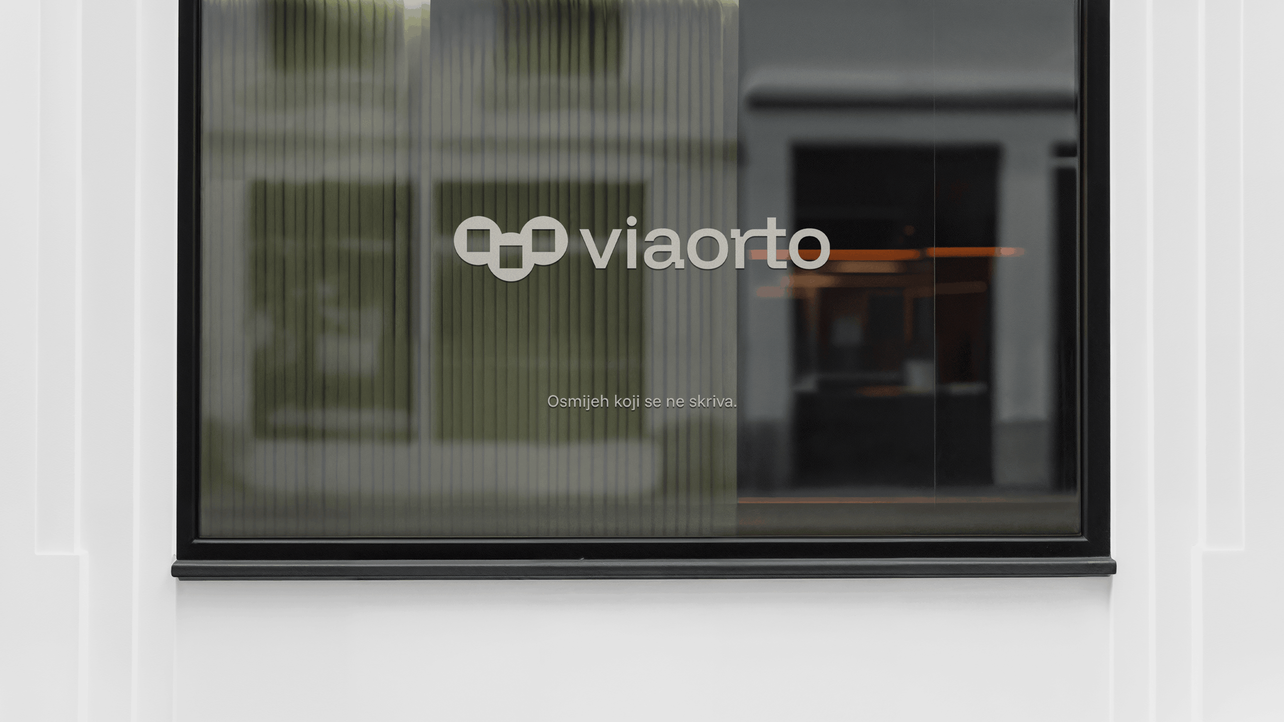
Viaorto – Visual Identity
From Beautiful Irregularity to Perfect Alignment
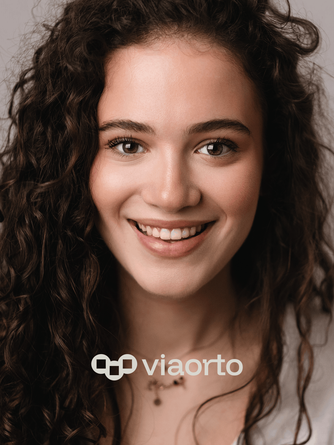
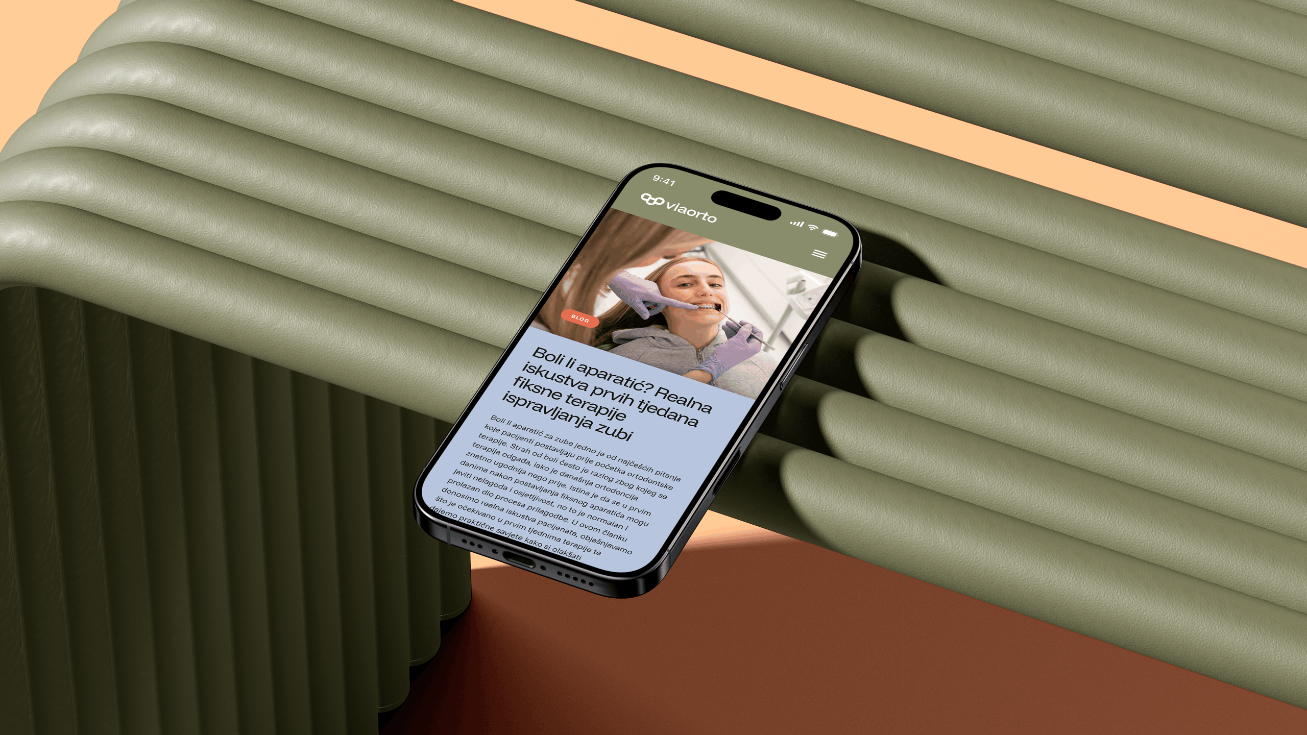
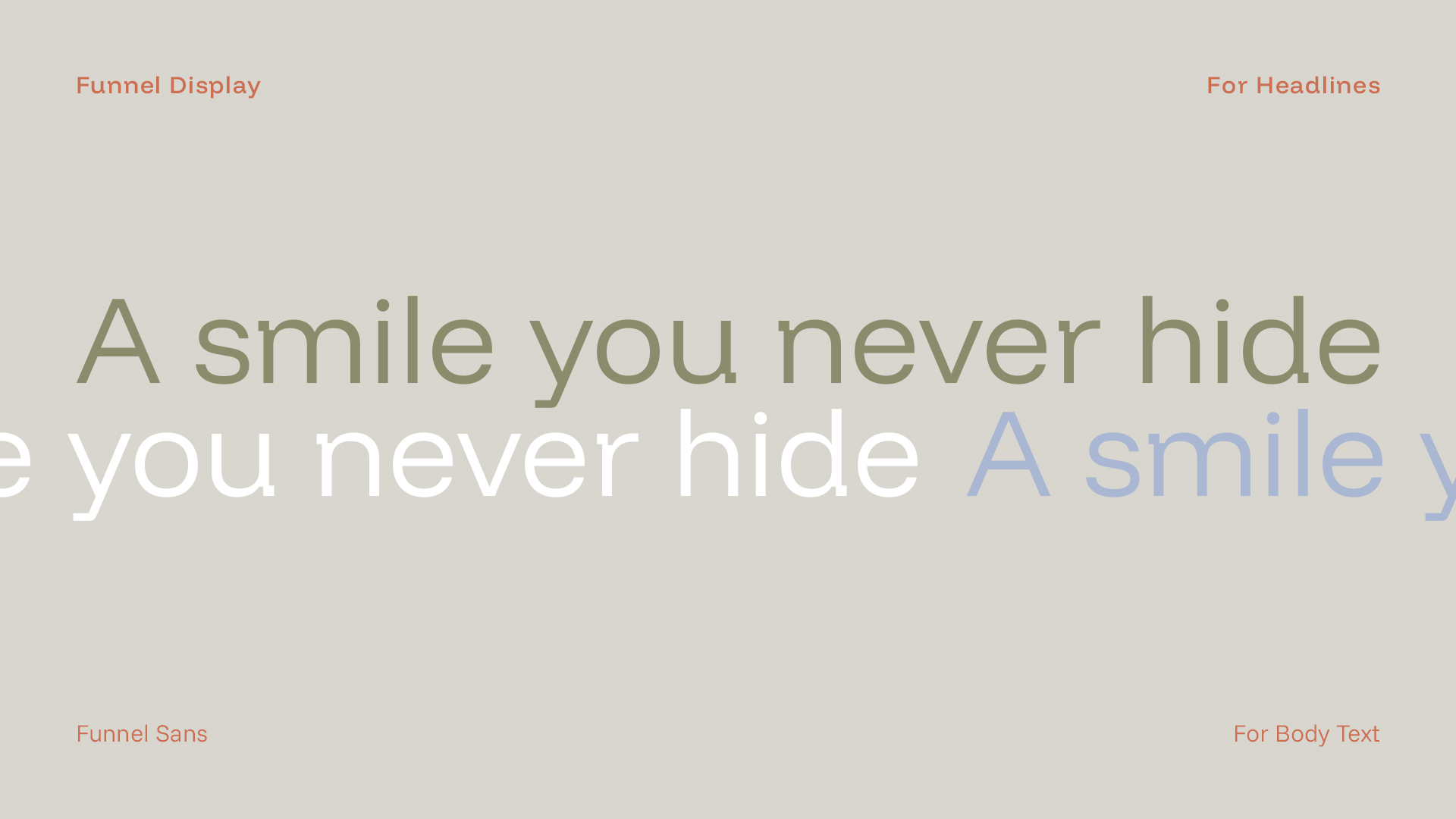
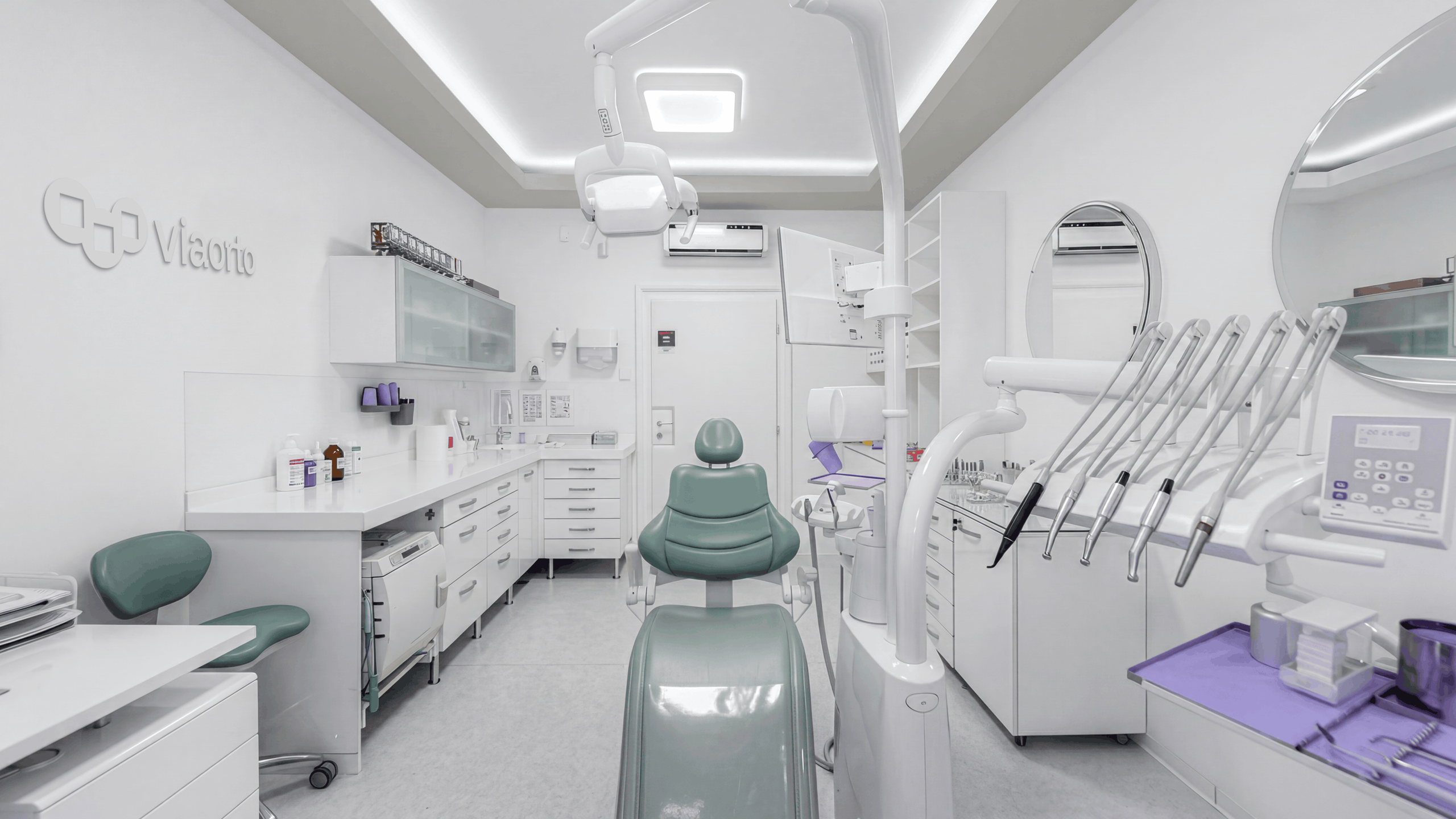
Viaorto is an orthodontic practice in Zagreb with the ultimate goal of helping its patients achieve a smile they never hide.
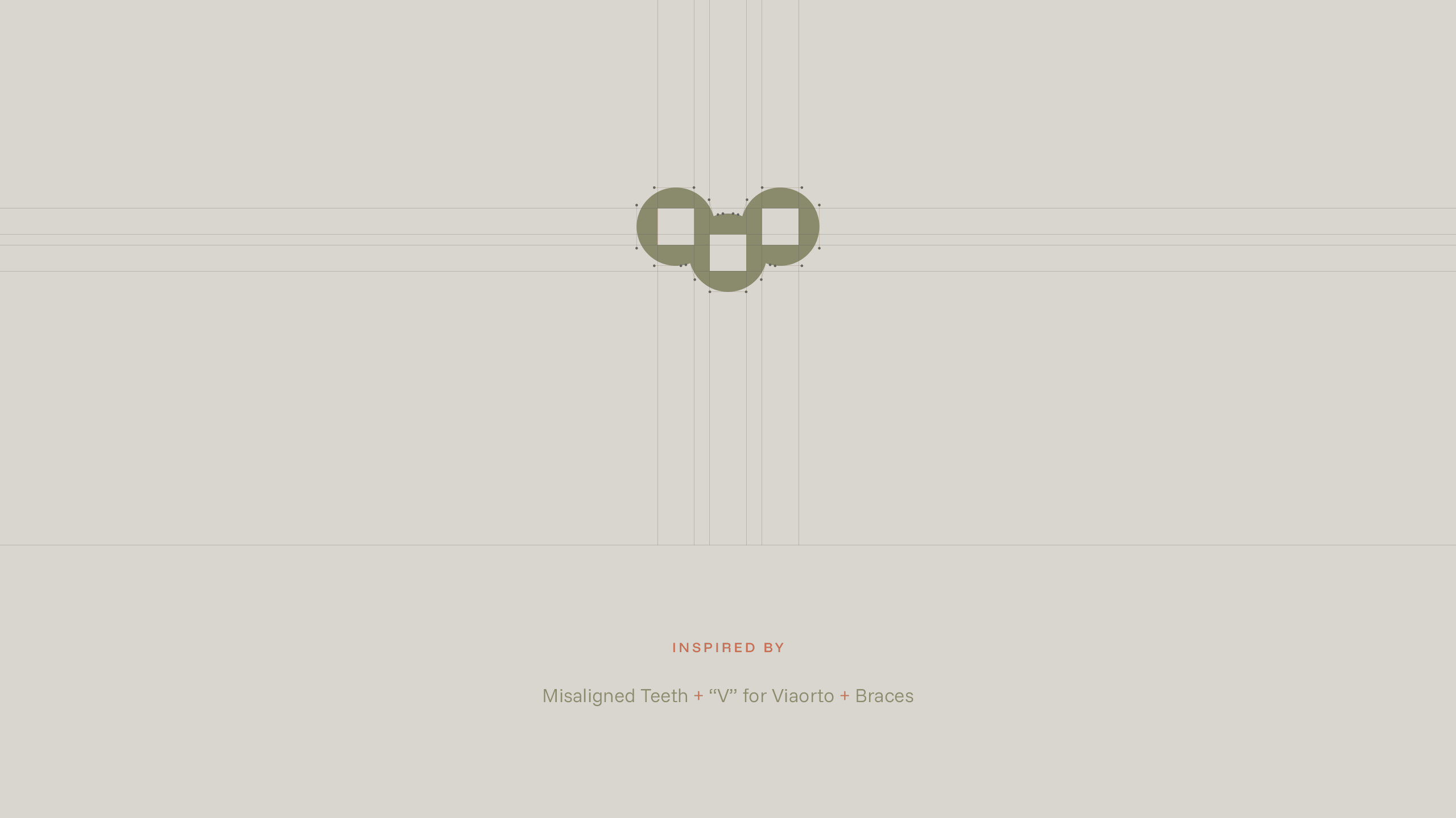
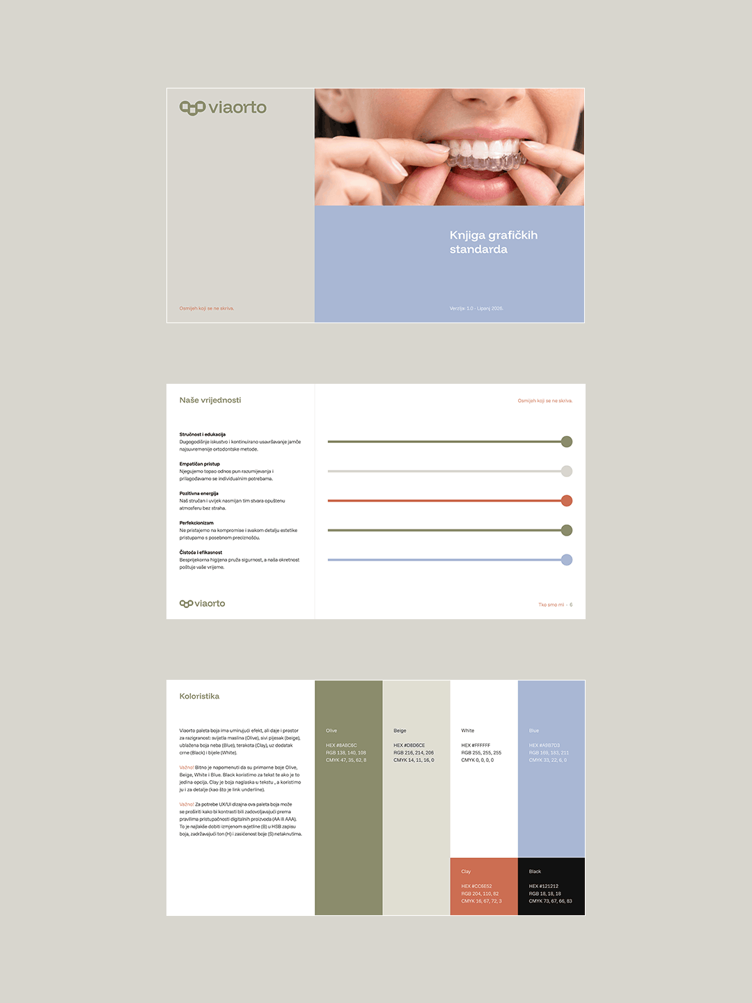
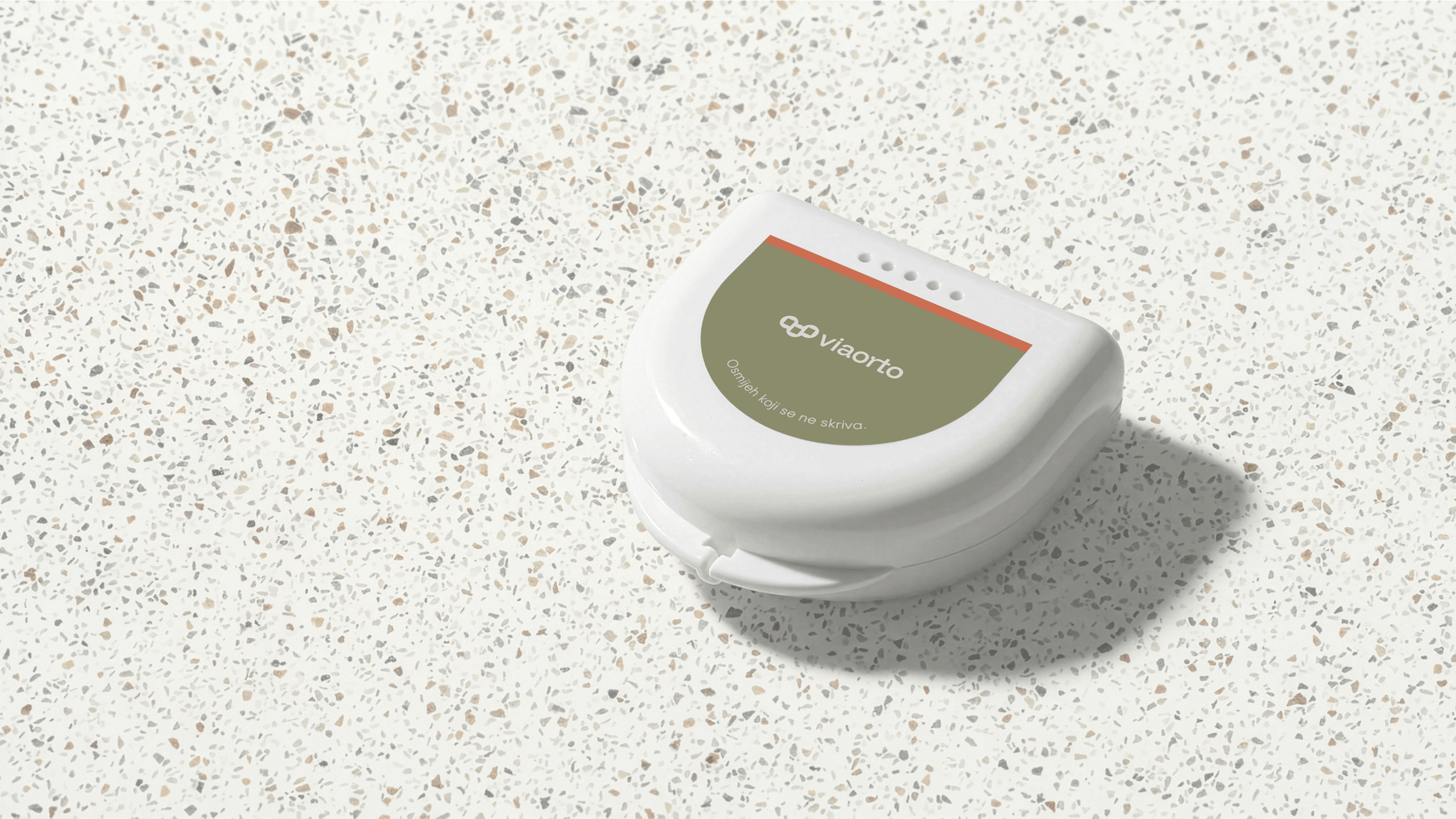
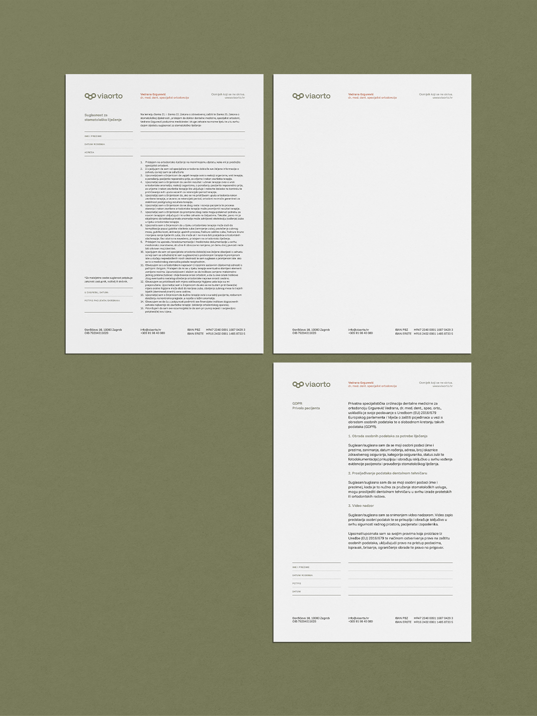
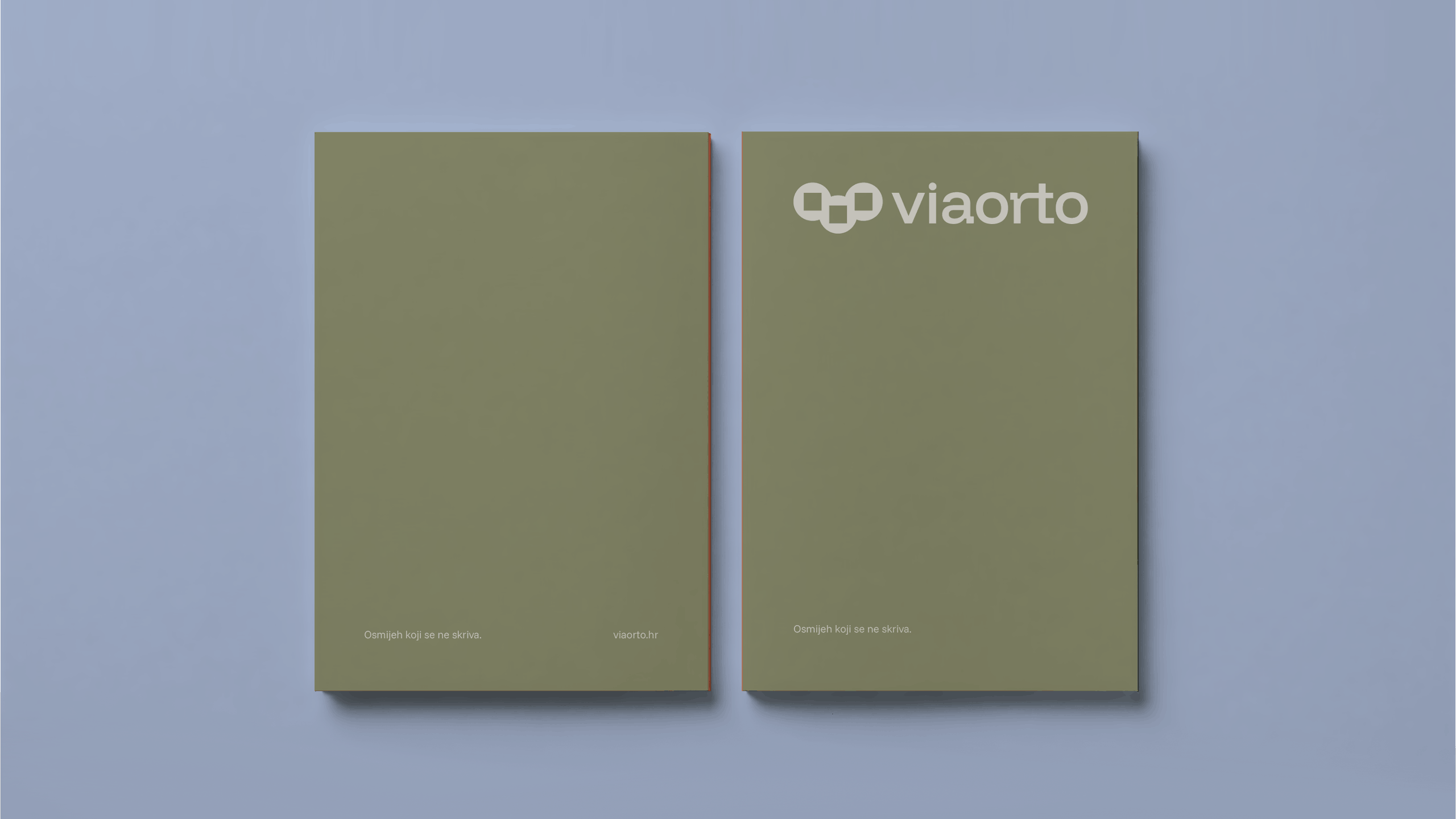
The geometric logo mark acts as a metaphor for the orthodontic journey: moving from beautiful irregularity to perfect alignment. Every detail of this brand identity is crafted to convey trust, clarity, and the modern elegance of healthcare.


CREDITS
Creative Direction, Graphic Design & Visualizations - Miro Tomić, Emtisquare
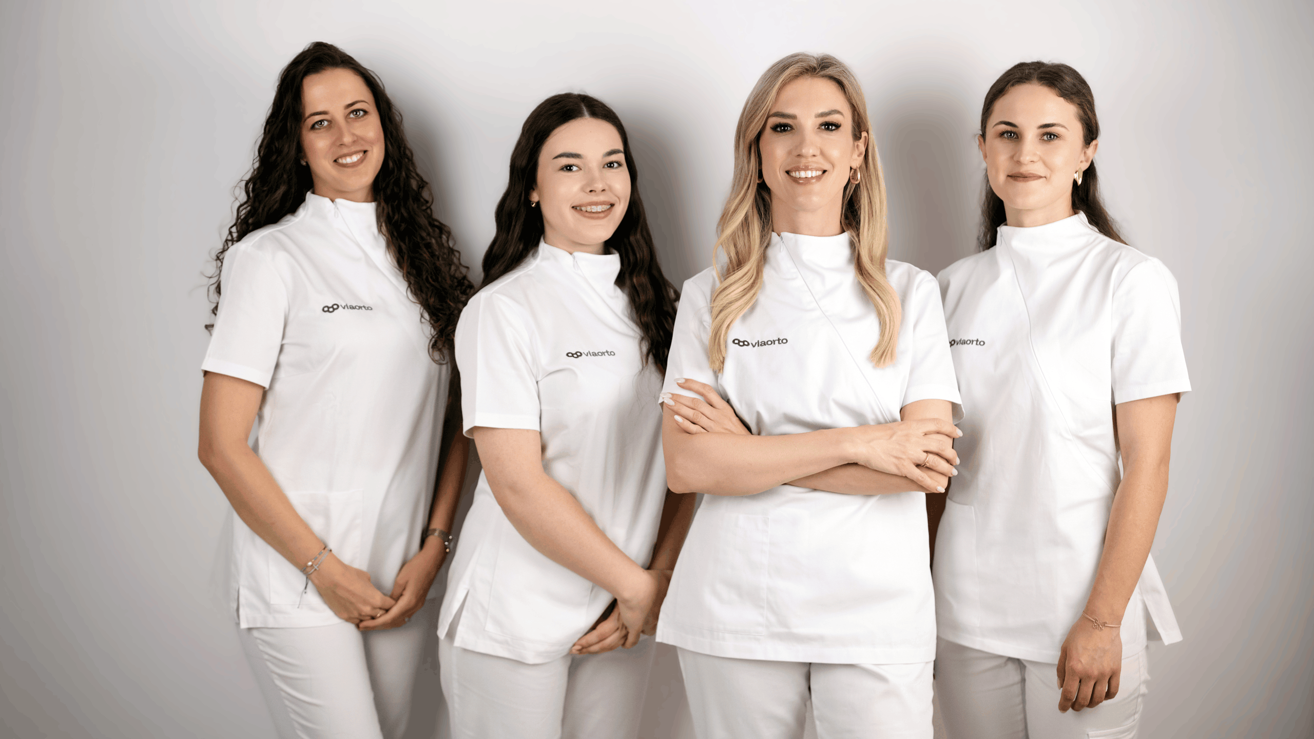
Portrait Photography - Karlo Šutalo for Viaorto
See Other Projects

H2EM - Visual Identity for Contemporary RestorationVisual Identity
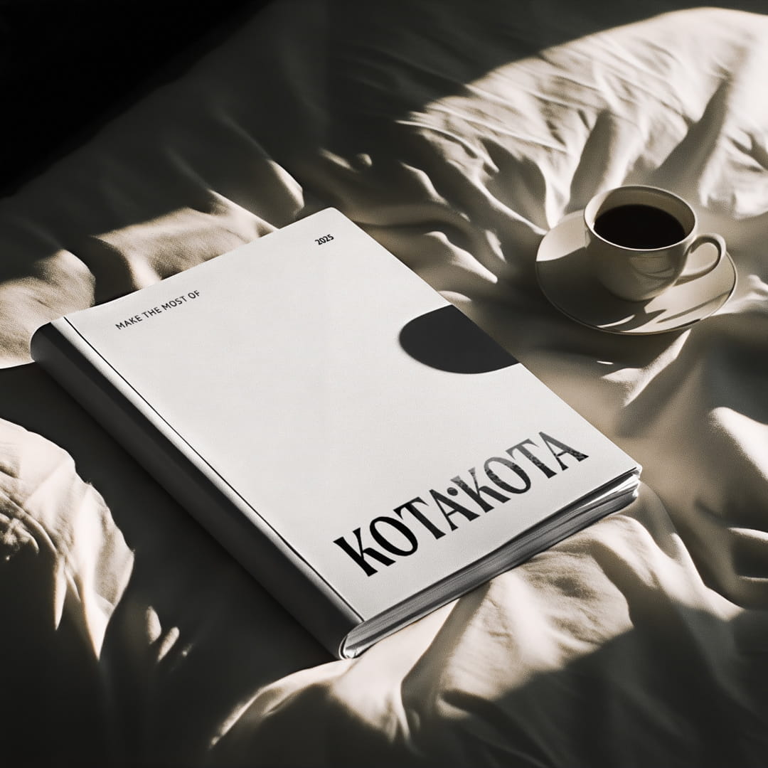
kota.kota BrandingVisual Identity
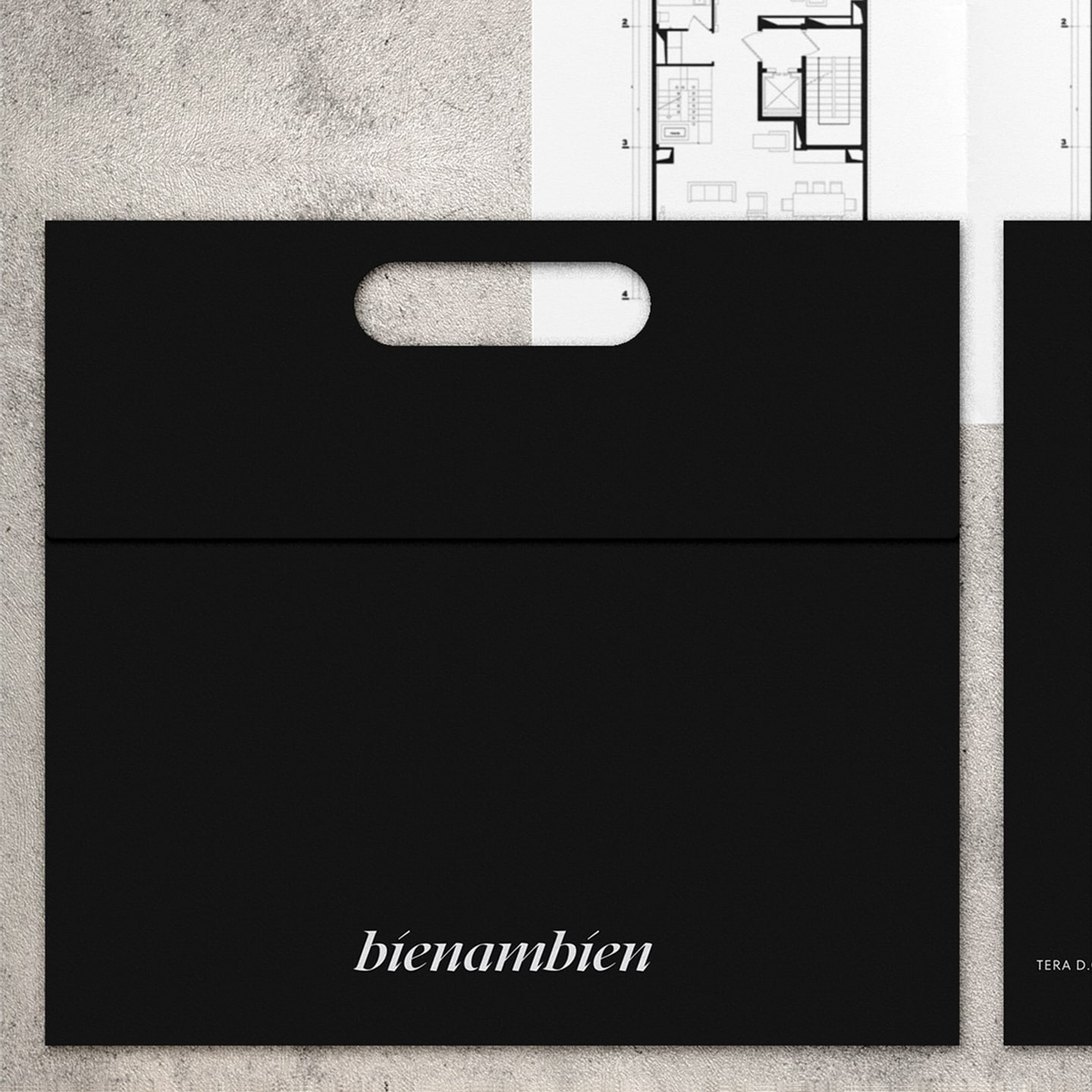
BienambienNaming & Branding
Firefly AgencyVisual Identity & Web Design

Honey PejićVisual Identity & Packaging Design
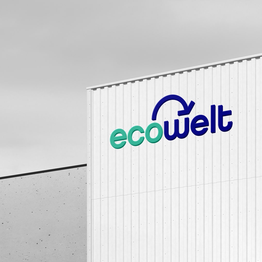
EcoWeltVisual Identity Redesign + Web Design
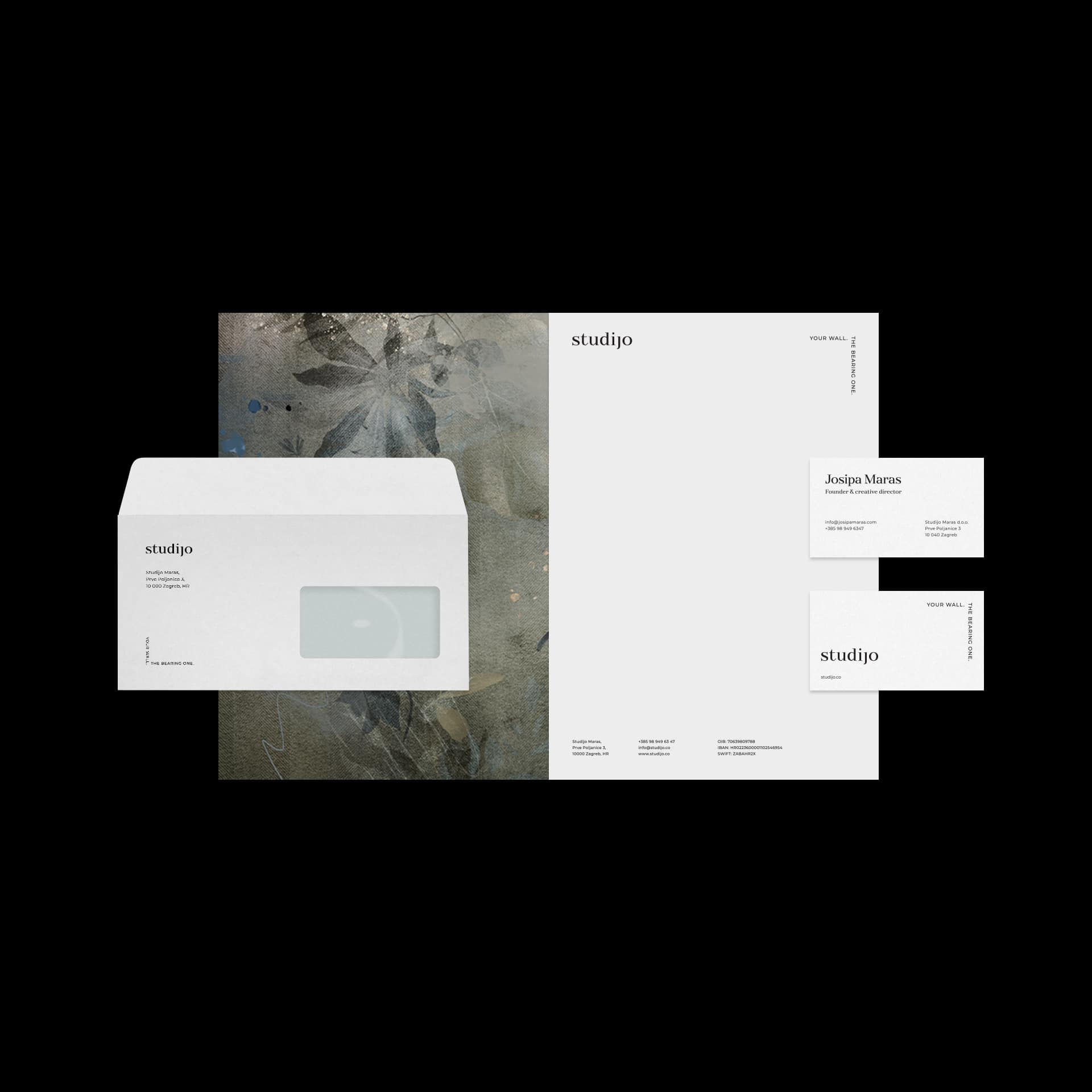
StudijoVisual Identity
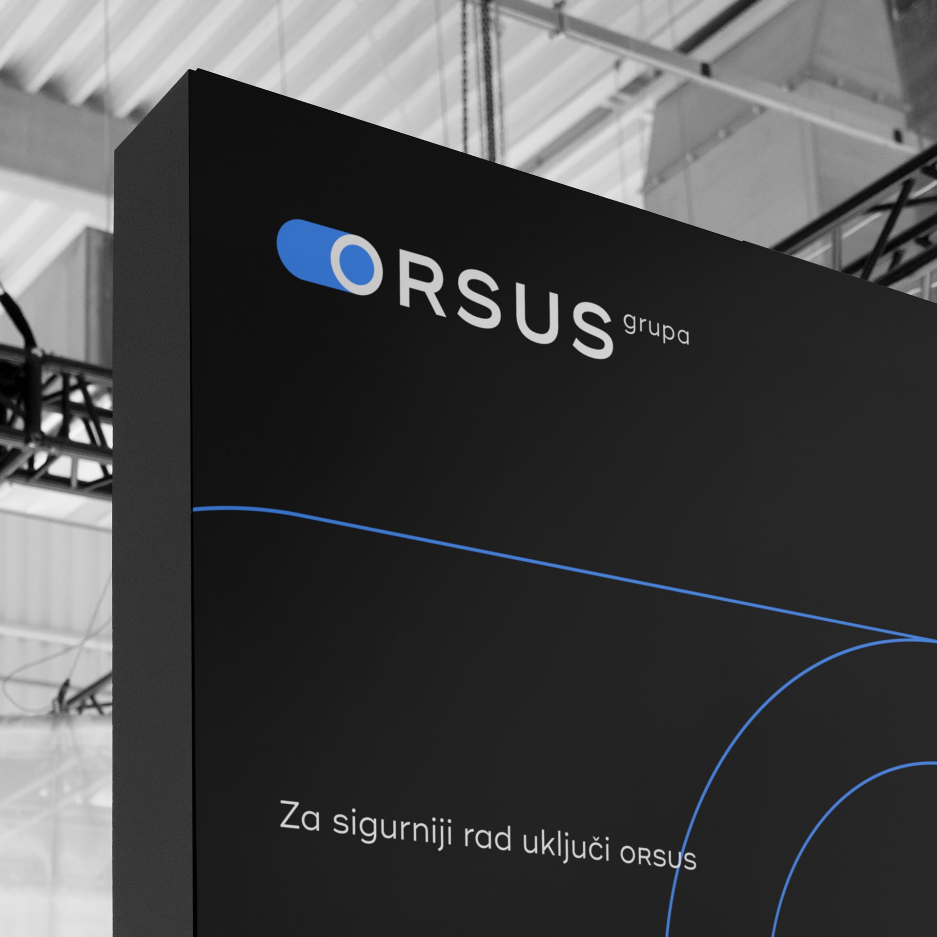
Orsus grupaVisual Identity & Web Design
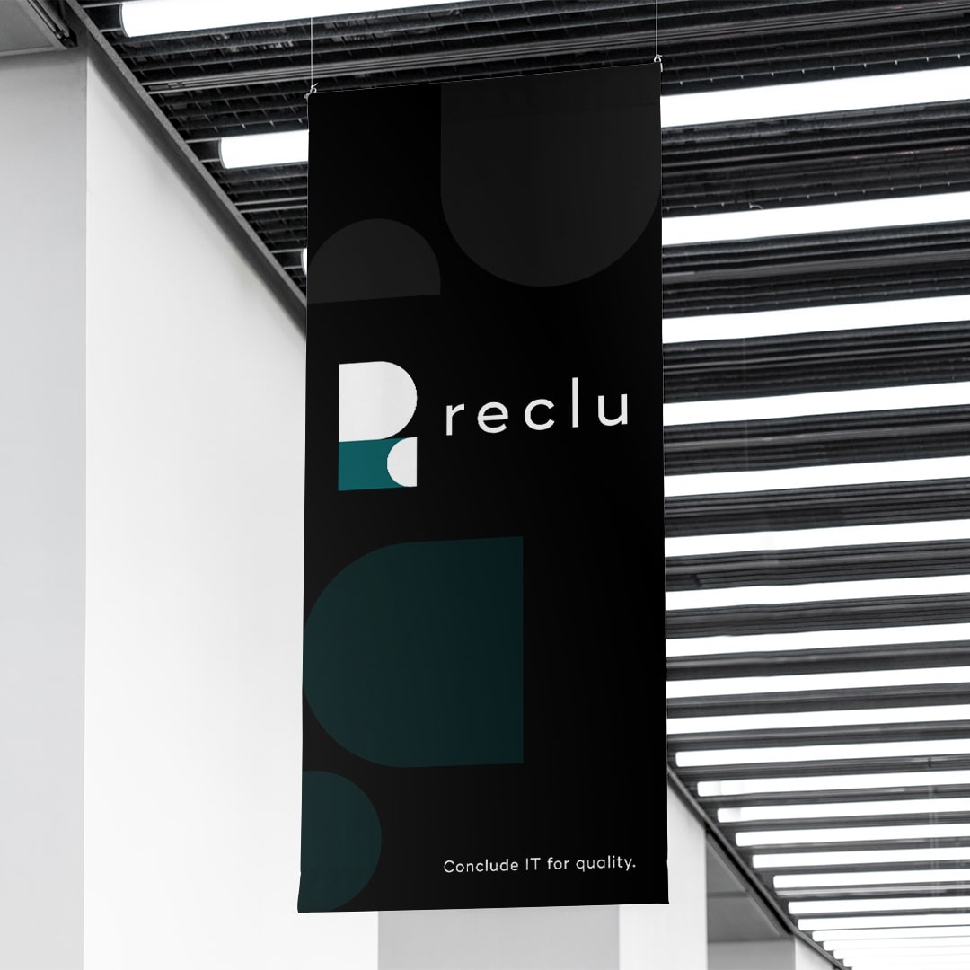
RecluVisual Identity
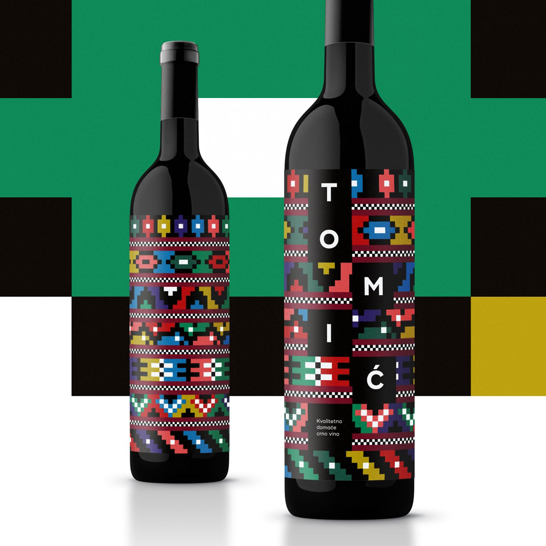
From Herzegovina. From the heart.Experimental & Packaging Design
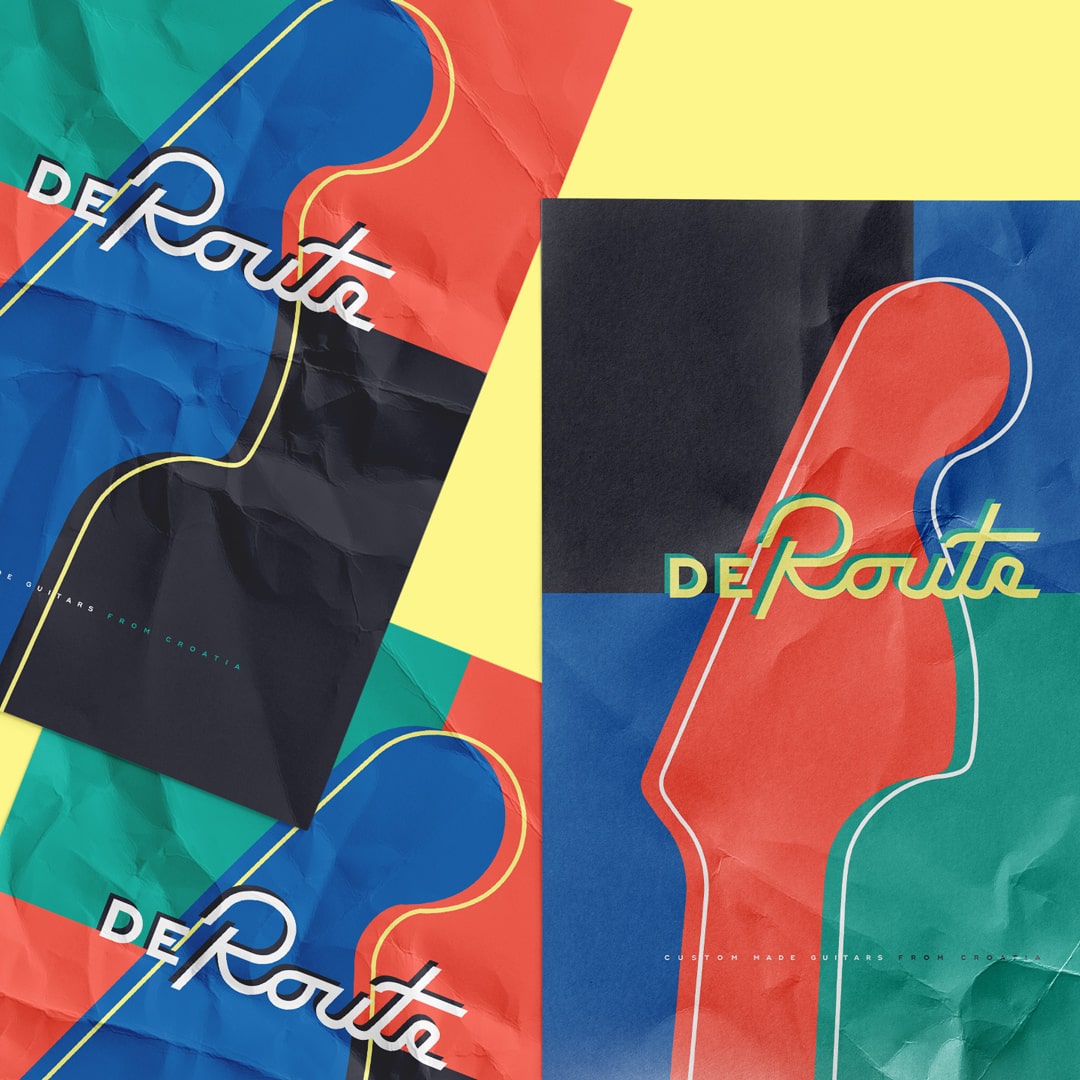
DeRoute Custom GuitarsVisual Identity
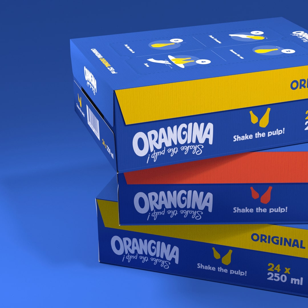
Orangina Transport PackagingPackaging Design
Emtisquare, vl. Miro Tomić
Hvarska ulica 8A
10000 Zagreb, Croatia
VAT: HR 04185597471
E-mail: info@emtisquare.com
Instagram: emtisquare
LinkedIn: emtisquare
Behance: mirotomic
© Emtisquare / Miro Tomic & respected owners of the logos. All rights reserved. Do not use the materials from this site without written permission of the owner(s).
