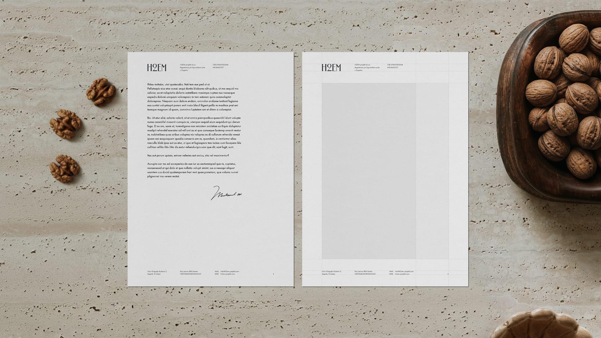
H2EM – Visual Identity
The Bridge Between Heritage and Future
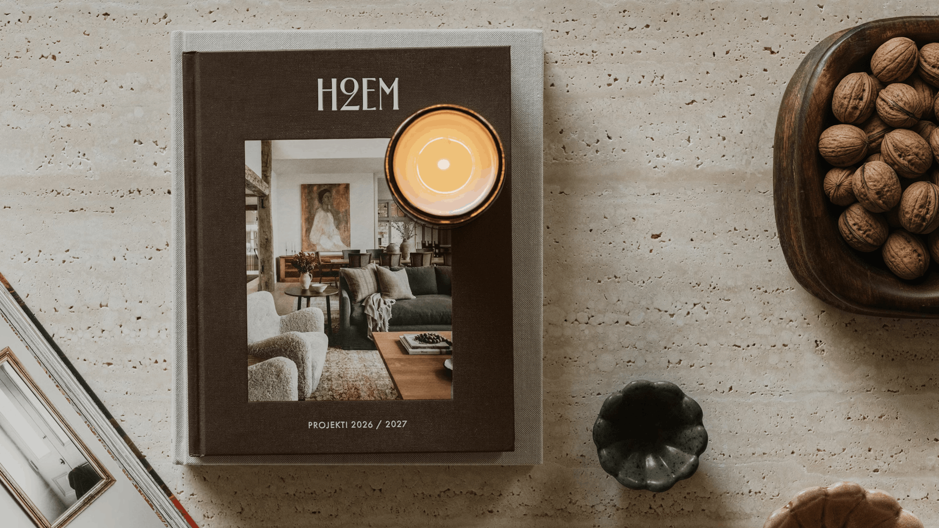
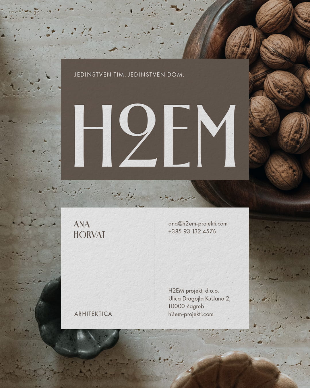
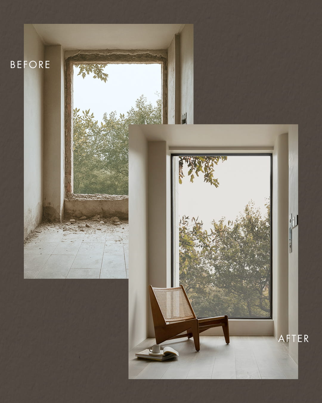
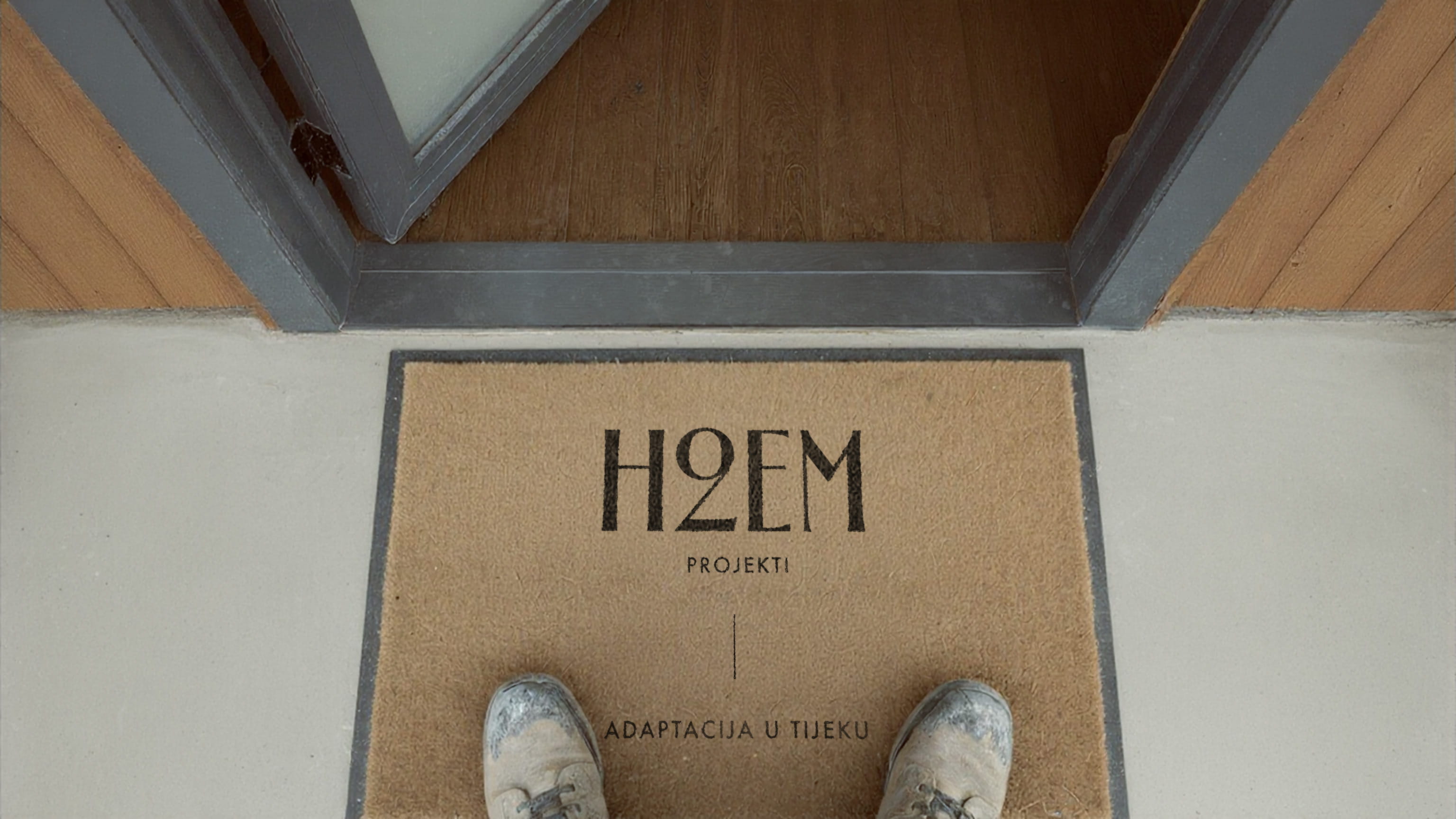
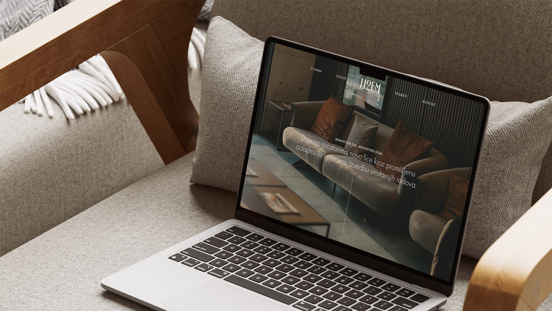
H2EM is design and renovation studio focused on preserving the soul of aged spaces through modern engineering and sophisticated interior styling.
The core challenge was to visually reconcile the robustness of construction work with the refinement of interior design. For H2EM, we developed an identity that celebrates the "patina of time" by interpreting it through clean, contemporary lines. The branding does not seek to mask the age of the structures; instead, it elevates them through a high-end aesthetic.
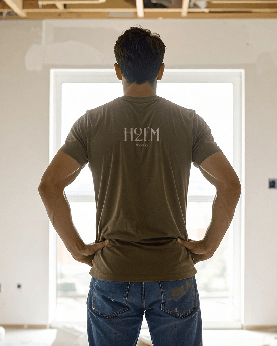
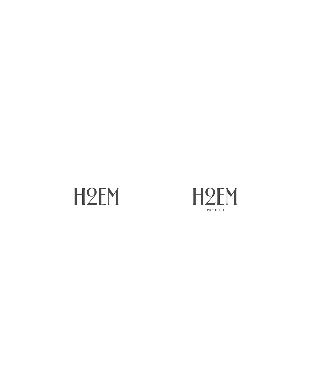
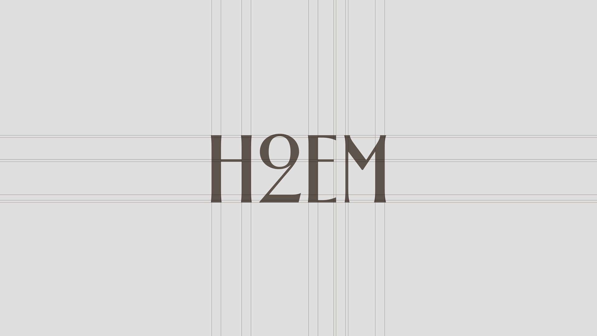
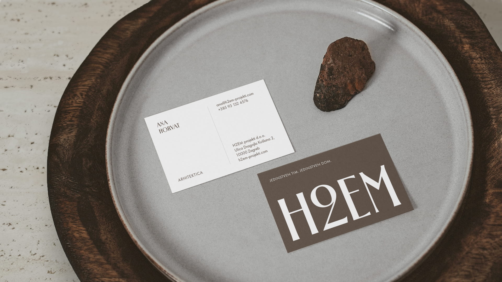
Typographic Logo and Logo Mark
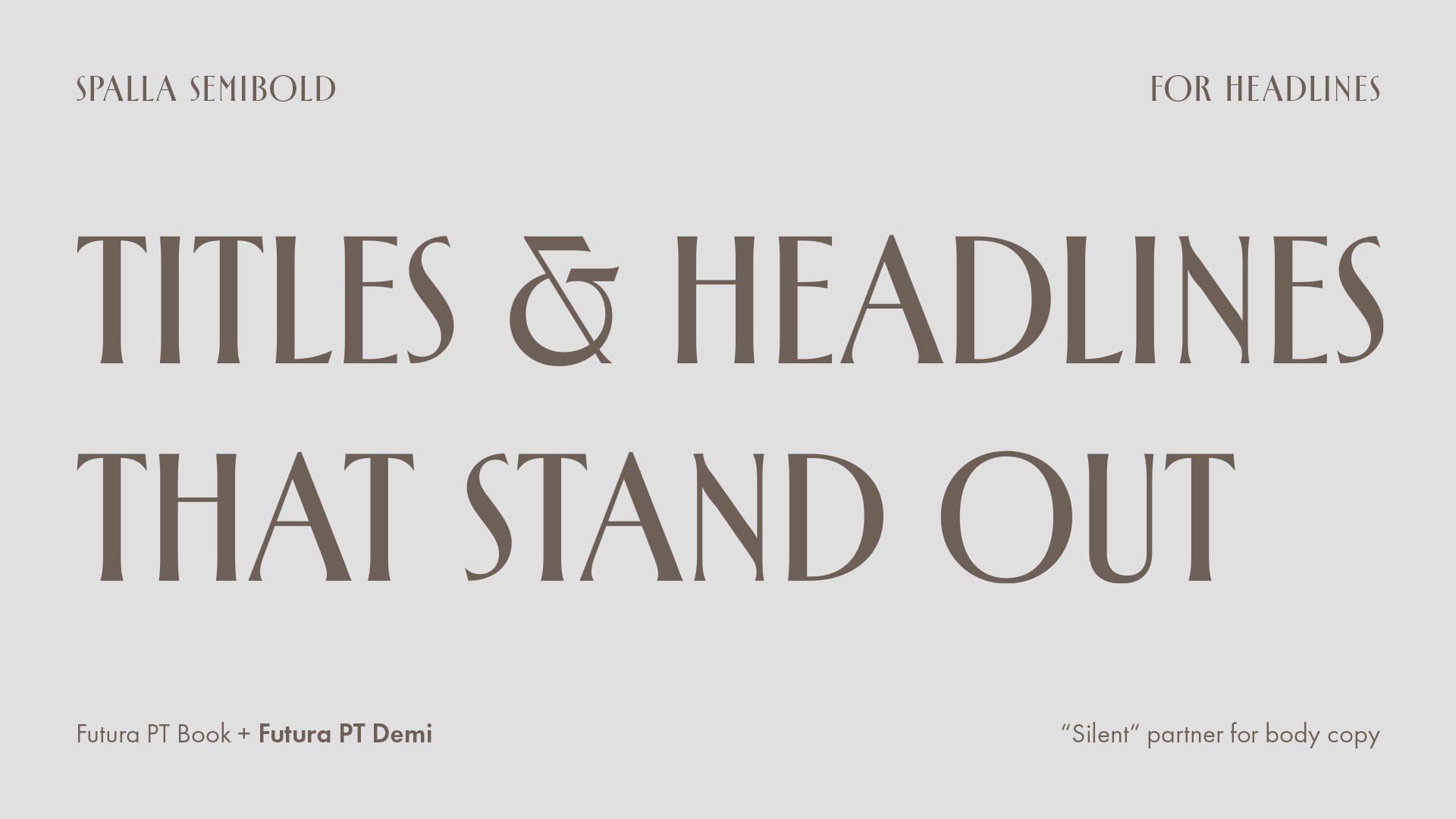
The typographic selection was instrumental in establishing the brand’s tonal frequency:
- Spalla SemiBold (Headlines): Used exclusively for headings, Spalla’s incised character and serif elegance evoke history, craftsmanship, and permanence. It serves as the voice of authority that respects heritage.
- Futura PT (Body Copy): For all textual content, we utilized a combination of Book and Demi weights. Futura’s geometric purity provides a perfect modernist contrast to Spalla, ensuring legibility and a visual "calm" essential for the technical aspects of renovations.
Color Palette and Materiality
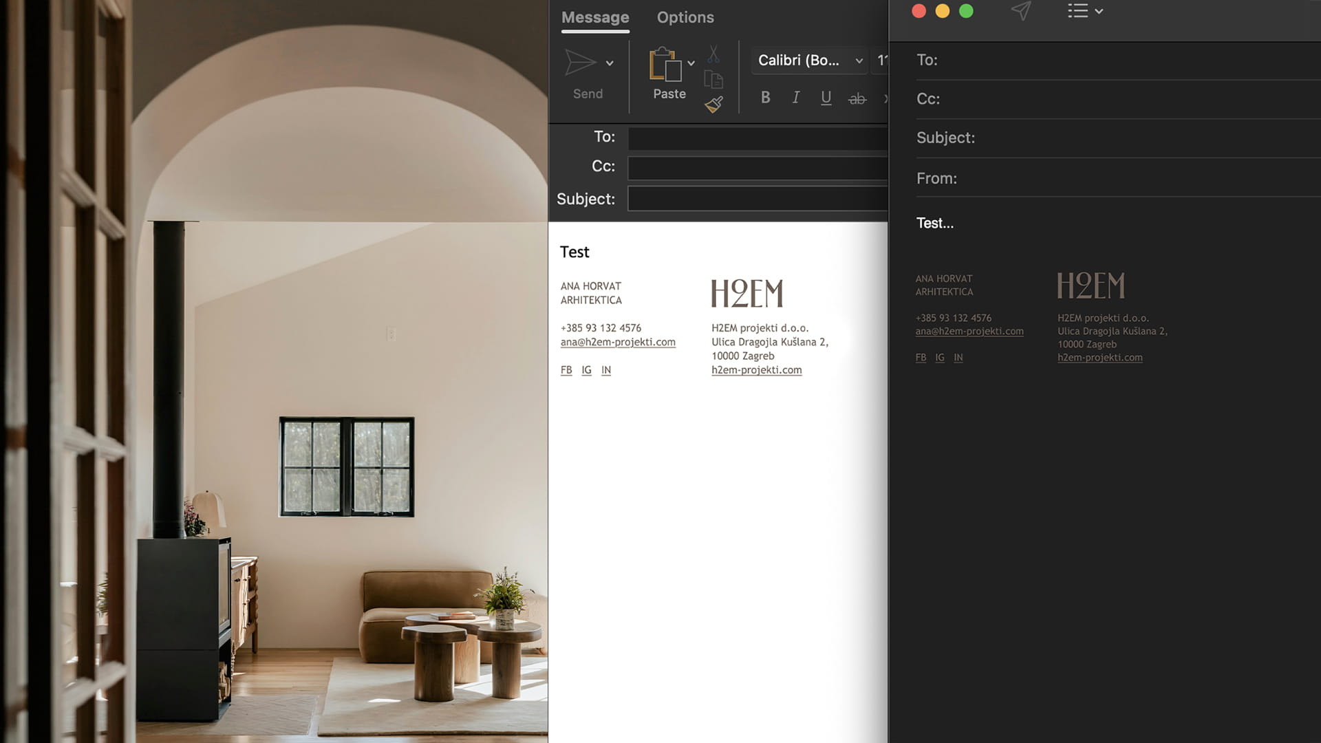
The color story is directly inspired by the construction site and the natural world. Dominant earthy ochres and terracotta tones are paired with deep charcoal black, creating a sense of warmth and sophisticated luxury. Visual assets, from business cards to digital interfaces, utilize textures reminiscent of natural stone and raw concrete, emphasizing the tactile nature of H2EM’s craft.

CREDITS
Creative Direction, Graphic Design & Visualizations - Miro Tomić, Emtisquare
See Other Projects
kota.kota BrandingVisual Identity
BienambienNaming & Branding

Firefly AgencyVisual Identity & Web Design
Honey PejićVisual Identity & Packaging Design
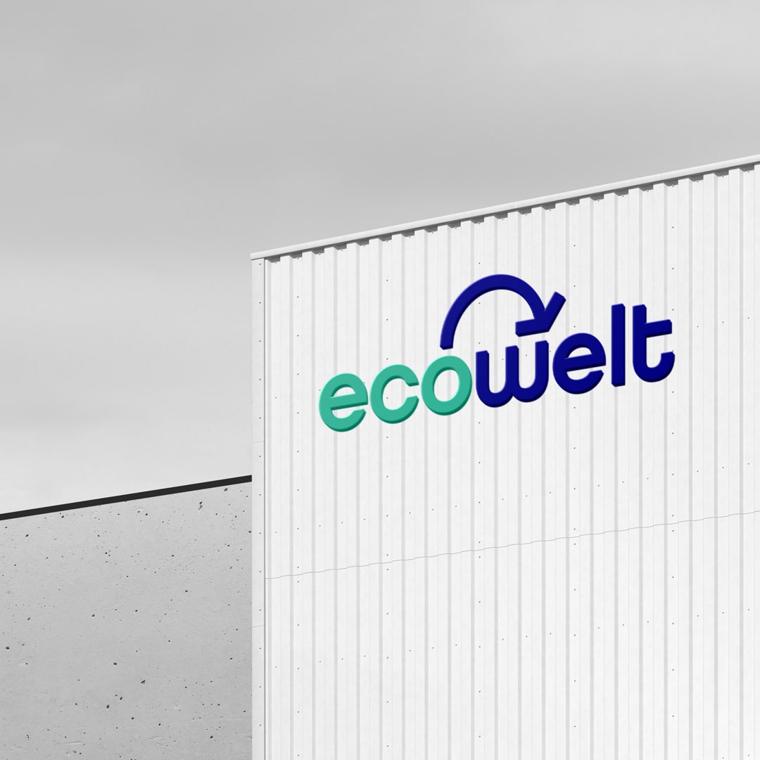
EcoWeltVisual Identity Redesign + Web Design
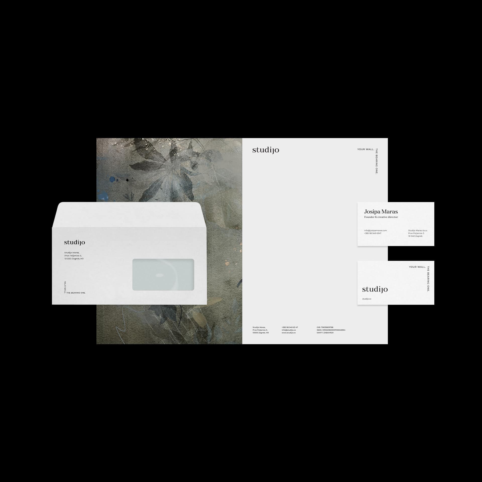
StudijoVisual Identity
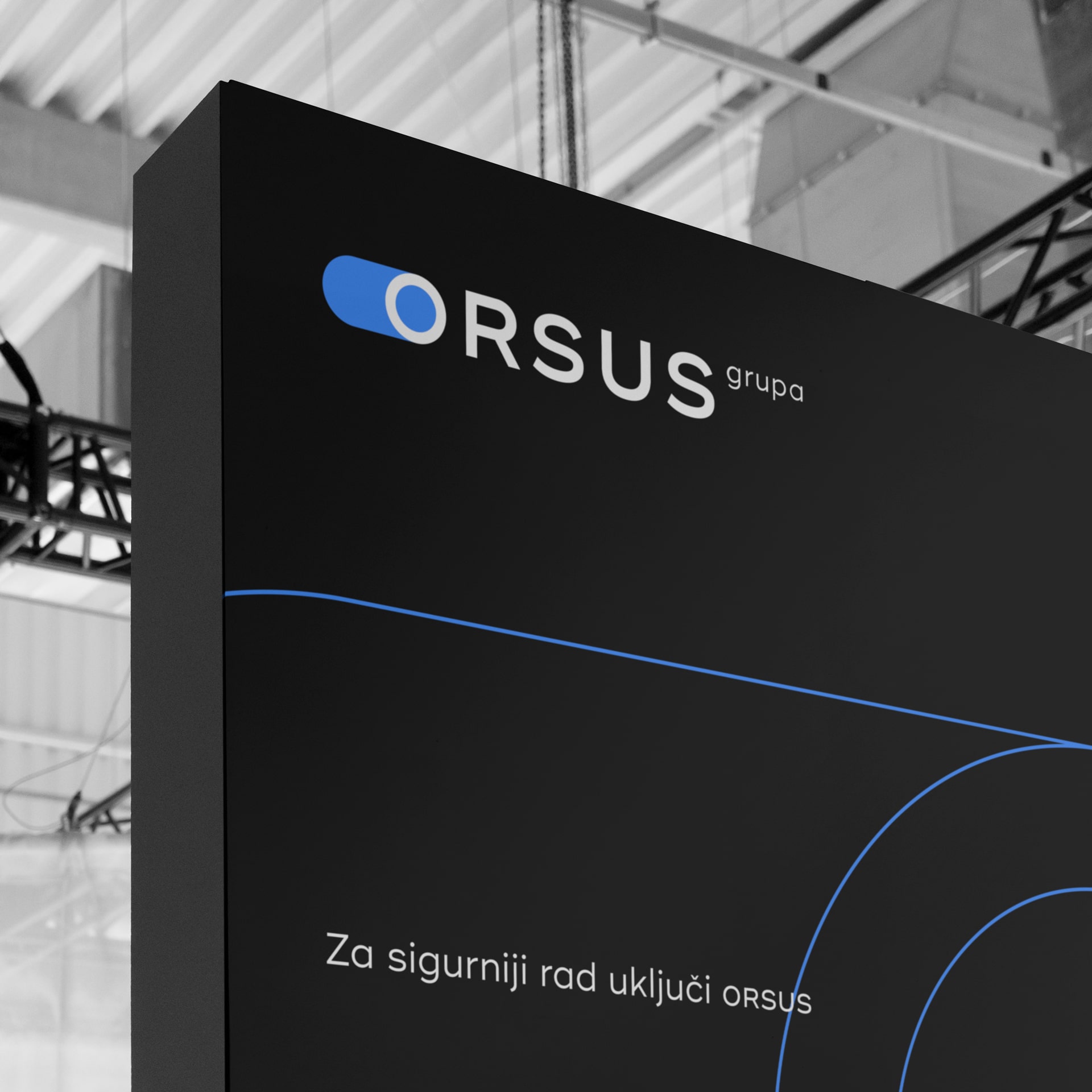
Orsus grupaVisual Identity & Web Design
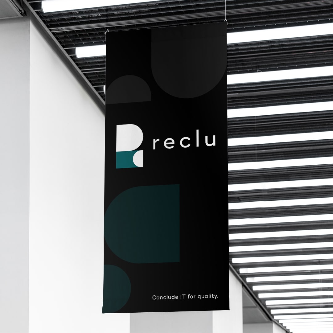
RecluVisual Identity
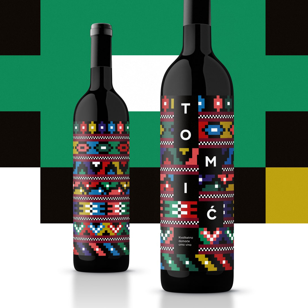
From Herzegovina. From the heart.Experimental & Packaging Design
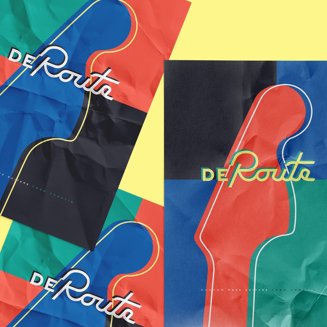
DeRoute Custom GuitarsVisual Identity
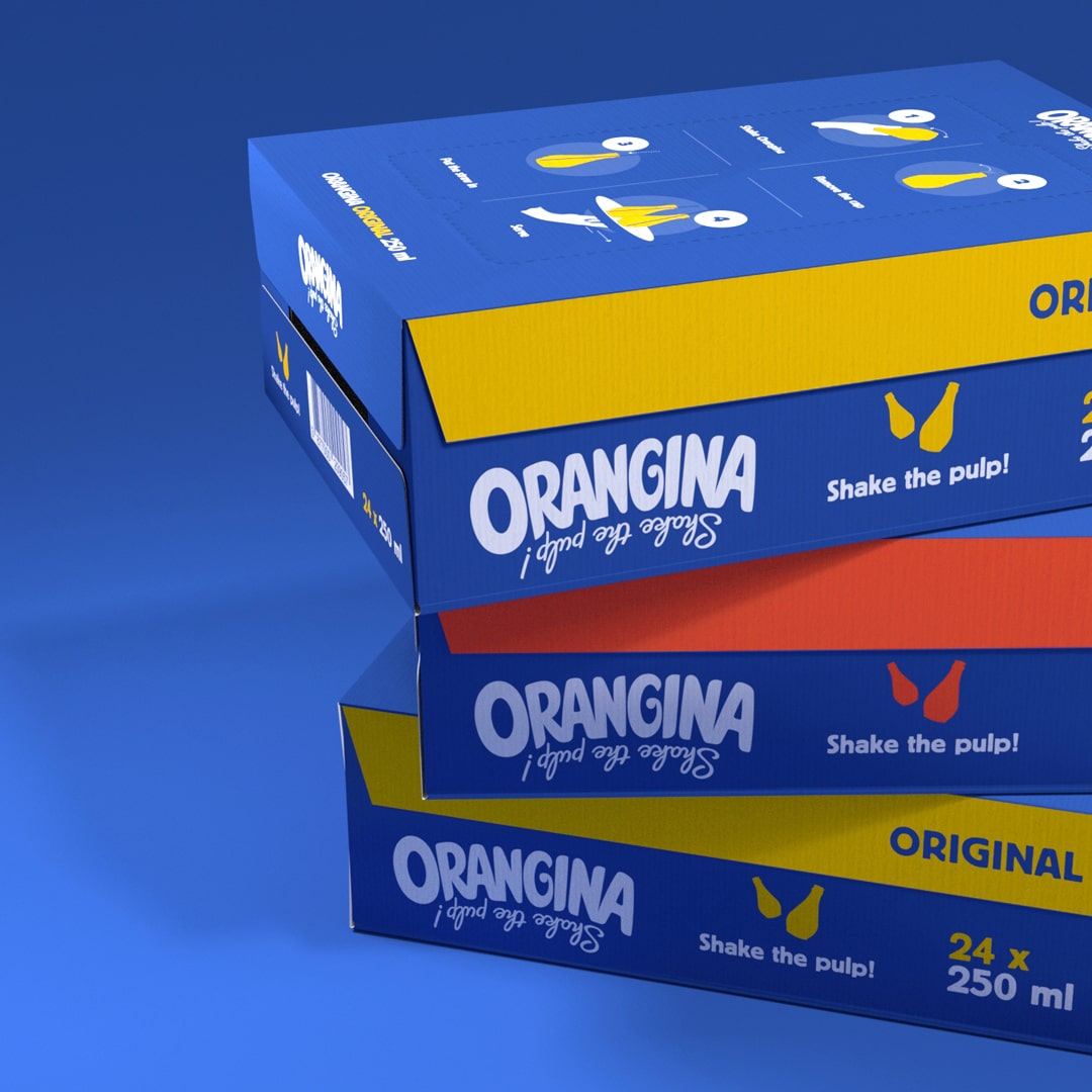
Orangina Transport PackagingPackaging Design
Emtisquare, vl. Miro Tomić
Hvarska ulica 8A
10000 Zagreb, Croatia
VAT: HR 04185597471
E-mail: info@emtisquare.com
Instagram: emtisquare
LinkedIn: emtisquare
Behance: mirotomic
© Emtisquare / Miro Tomic & respected owners of the logos. All rights reserved. Do not use the materials from this site without written permission of the owner(s).